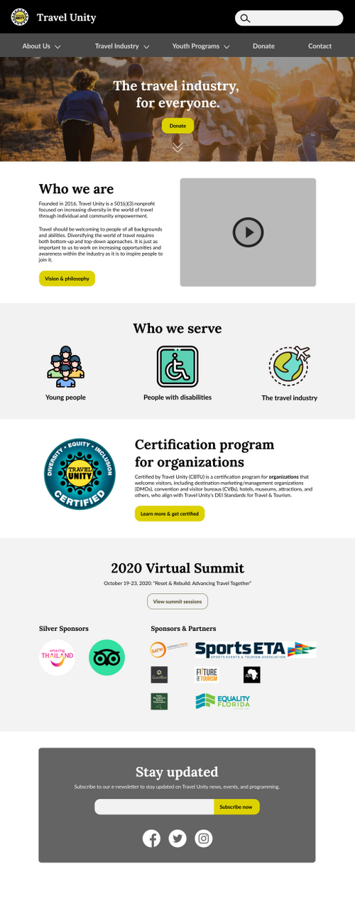
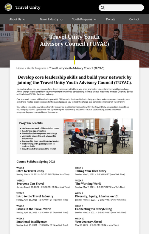
Travel Unity is a 501(c)(3) nonprofit organization focused on establishing and fostering diversity, equity, and inclusion standards across the travel industry through educational programs for young people, people with disabilities, and travel industry professionals.
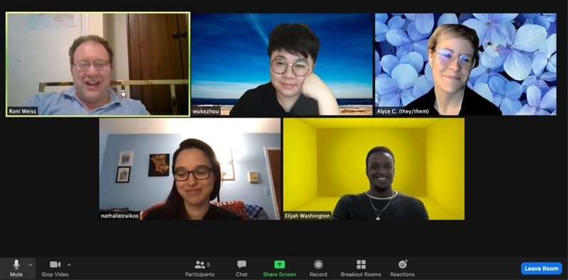
I collaborated with a team of four student usability researchers (myself, Chris Ferrara, Nathalie Traikos, and Wuke Zhou) as part of Pratt Institute’s Usability Theory and Practice course. We worked directly with the client to plan and conduct a usability study.
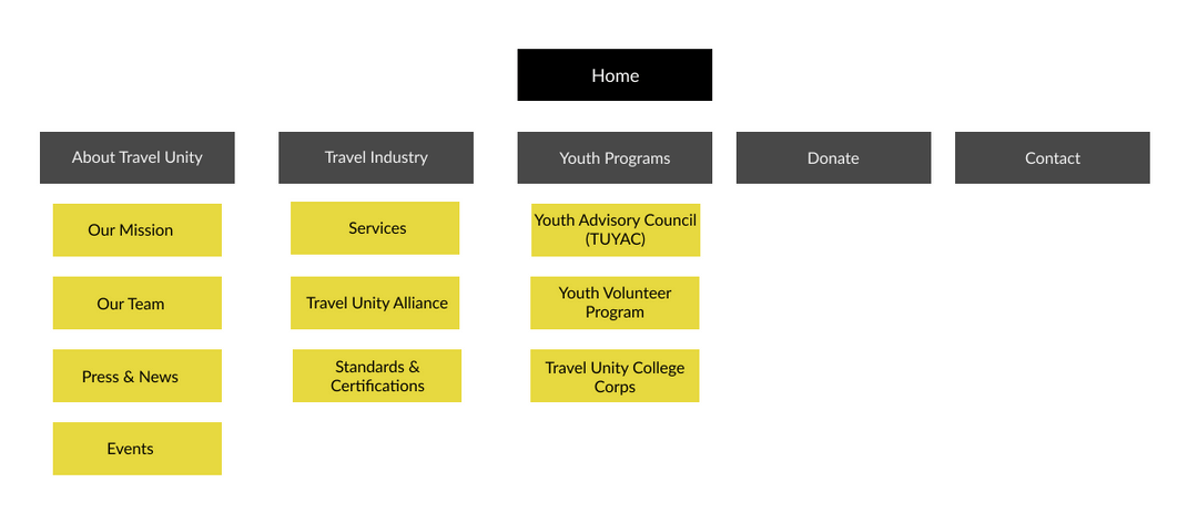
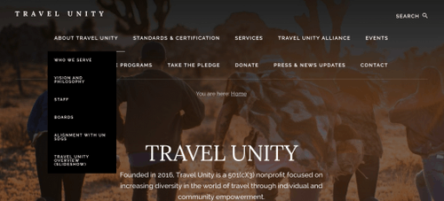
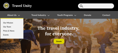
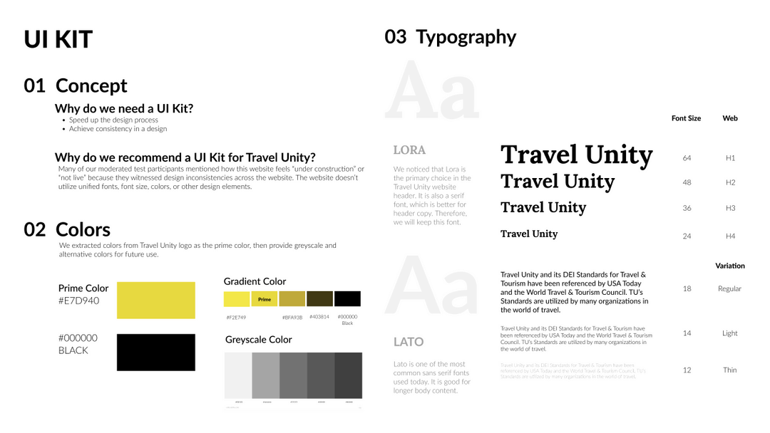
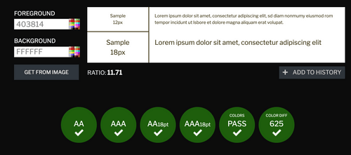
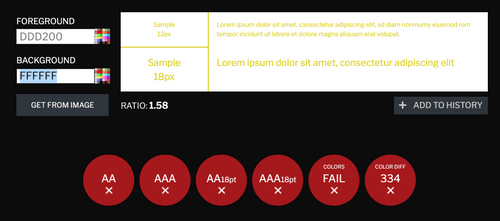
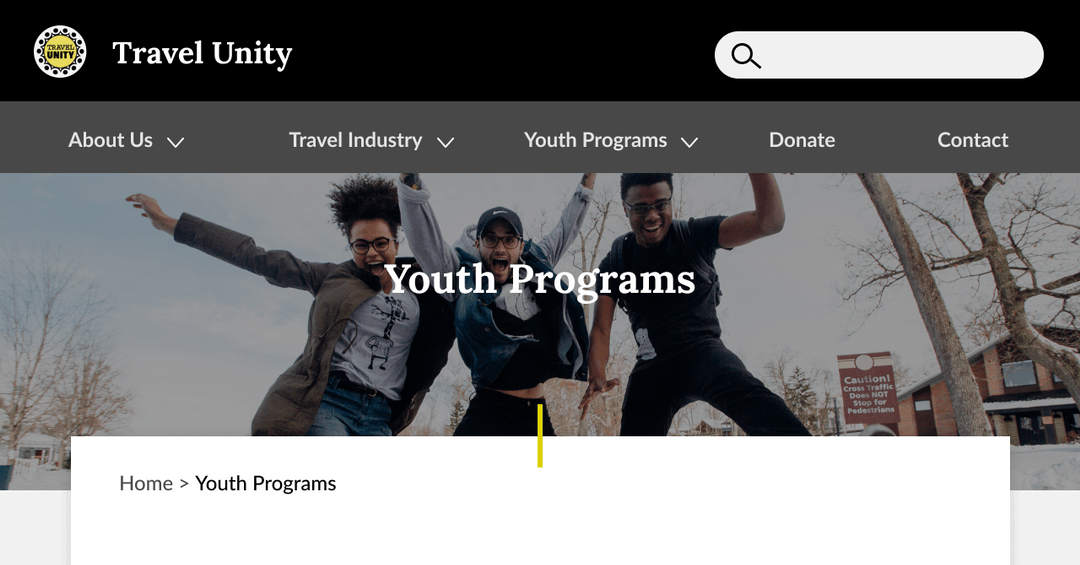
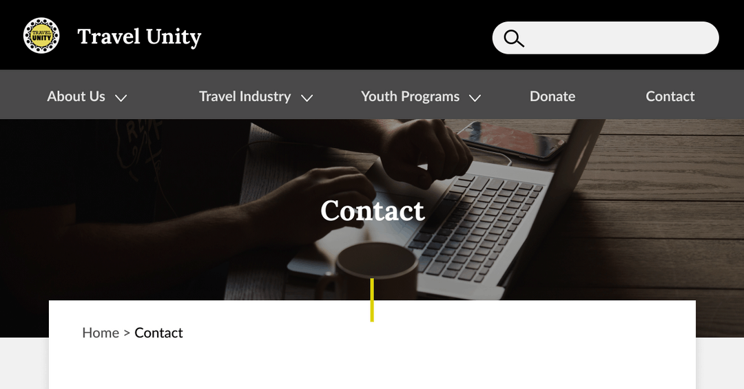
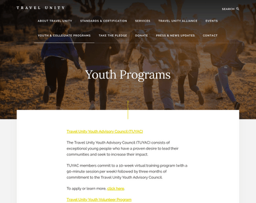
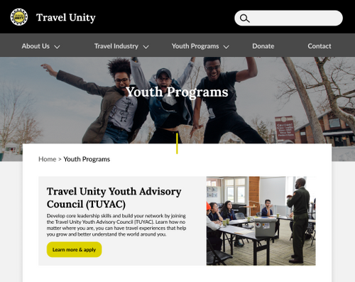
The final report and recommendations included a homepage redesign, improved navigation and information architecture, and further design and accessibility recommendations.
Download PDF Report Download PDF Presentation
Team / client
Pratt Institute - INFO-644
Usability Theory and Practice
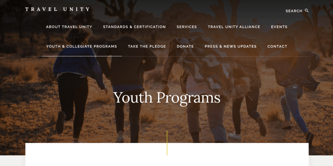
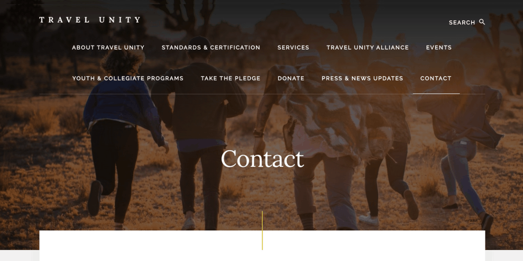
Travel Unity
My role
- Usability testing
- Qualitative data analysis
- UX design mockups
- Accessibility recommendations
- Presentation deck
Timeline
April - May 2021
6 weeks
Tools Used
- Figma
- Google Hangouts + Zoom
Usability TestingUX Design