Home / Projects / Jetset: A More Sustainable Approach to Music Touring
Jetset: A More Sustainable Approach to Music Touring
Designing a tool to make touring easier and more sustainable for DJs and musicians through "nudges."
Home / Projects / Jetset: A More Sustainable Approach to Music Touring
Designing a tool to make touring easier and more sustainable for DJs and musicians through "nudges."
Not every music event is as disastrous as Woodstock ‘99, and the impact isn’t always quite so visible, but there are a number of problem areas for sustainability in music... and opportunities for sustainable design. For this project, I decided to focus on the impact of touring musicians, particularly DJs and live performers in the electronic music scene.
The end products of this solo research and product design project, completed as a final project for Pratt Institute's Sustainable Interaction Design course, were interactive prototypes, a sitemap, a persona and user journey map, and a polished presentation of the process and results.
Presented at Pratt #INFOSHOW in May 2023.
Pratt Institute - INFO-671
Sustainable Interaction Design
November - December 2022
4 weeks
User ResearchProduct DesignSustainable Design
Before embarking at all on a design project, I completed a research presentation examining sustainable design in music broadly. This presentation covered a wide variety of problem areas within music as well as existing work towards addressing these issues.
As I continued my own work, I decided to focus on the environmental impact of touring musicians, particularly DJs and live performers in the electronic music scene.
Festivals & eventsFor the next wave of the project, I found myself on a tight timeline: I had about four weeks to complete the final project, where I had decided to focus on a product design to help address sustainability in music touring. Because of this limited timeframe, I designed a survey that would offer a pulse on touring artists and collect some qualitative data that I would otherwise have needed to conduct interviews to learn.
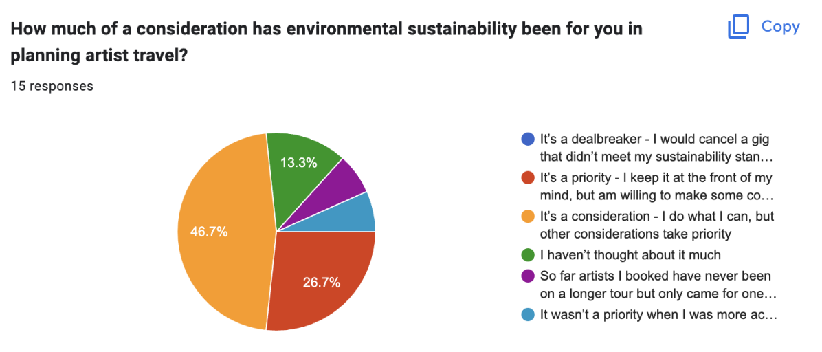
I set up the survey in Google Forms and distributed it across my own Twitter and Discord networks and received a total of 15 respondents from multiple regions of the North America and Europe. Because I wanted some amount of rich qualitative data, I compromised on the number of responses in order to get results that would feel more akin to the type of data I might have gathered from conducting interviews.
With more time, I would have loved to follow up with more generative research such as in-depth interviews and diary studies with musicians as they planned a tour. I would have also liked to conduct evaluative research, such as user testing or feedback sessions with the existing prototypes to continue iterating on the design.
Almost half of respondents stated that sustainability was a consideration, but that other considerations take priority. Top priorities for artists booking travel were efficiency of route, timing, and lowest price. Lowest priorities were amenities such as food options, duration of stay, and sustainability.
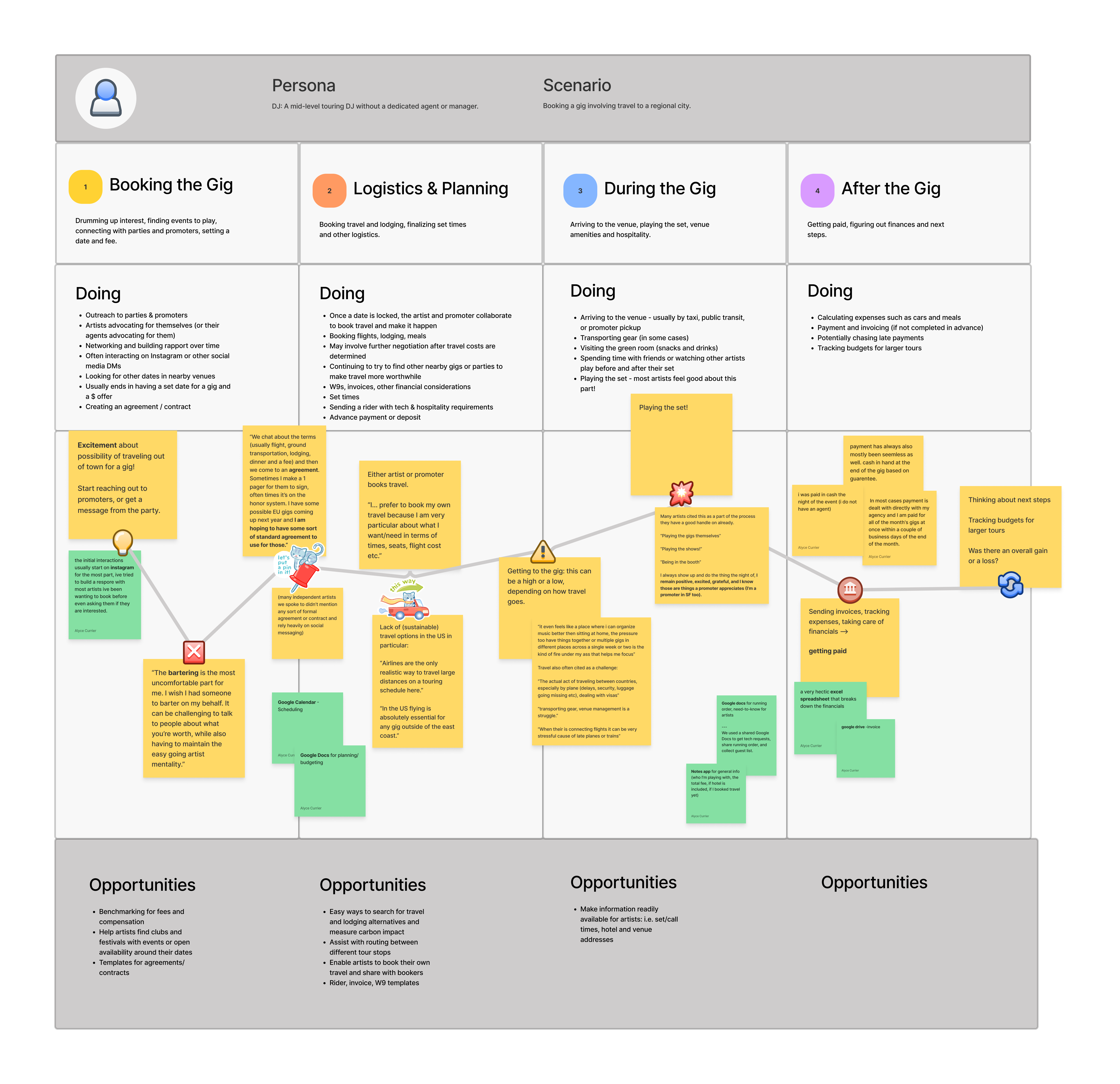
After completing the survey, I organized the results in a Figjam board to get a sense of the patterns, themes, and overall process an artist or booking agent goes through to book a gig.
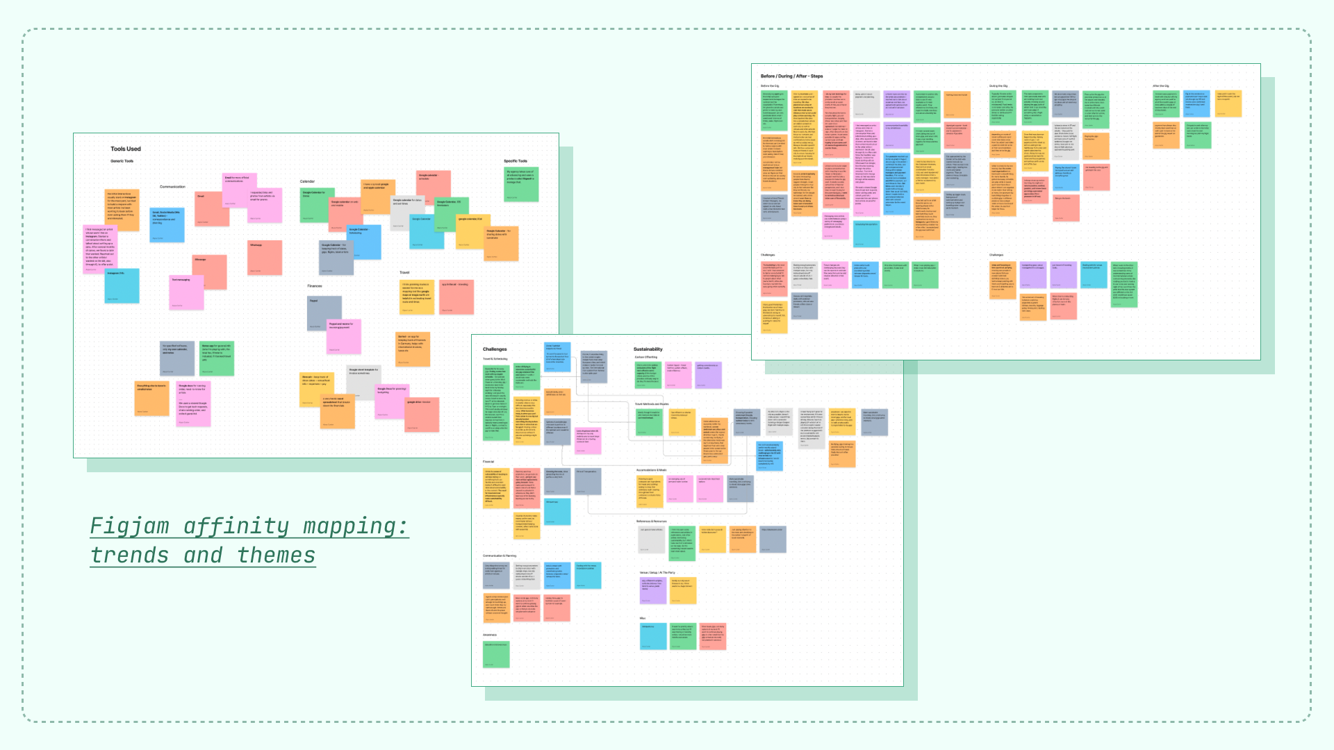
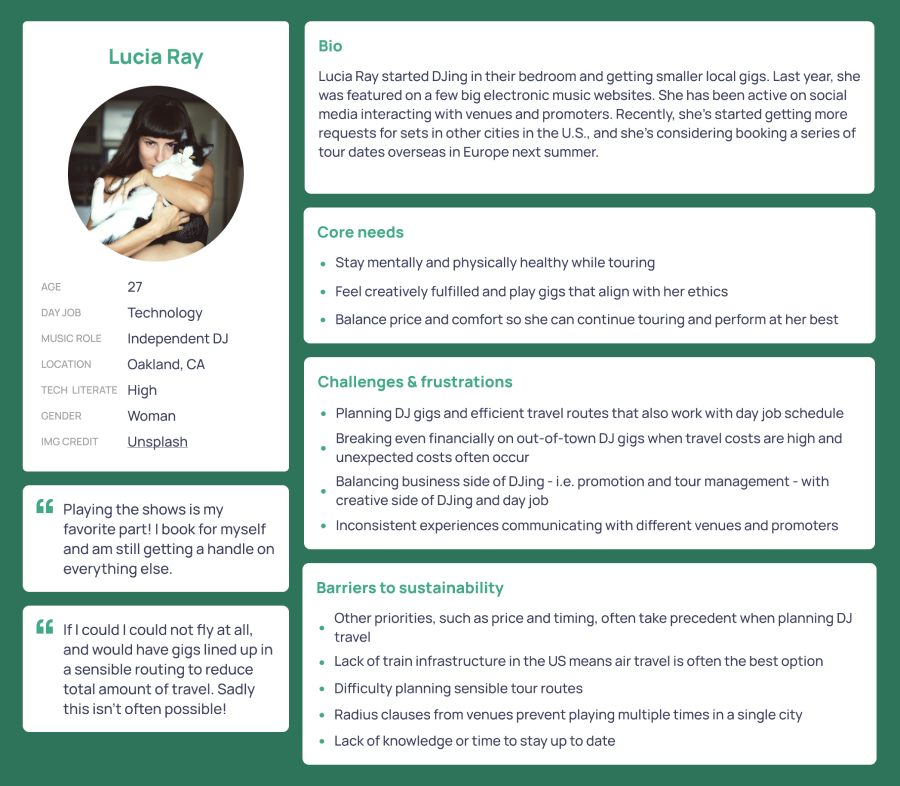
I synthesized the results of my analysis into several broader findings, as well as a user persona (modifying a Figma template for the layout) and user journey map.
Finding 1: Artists are comfortable playing shows and working their craft; most of their challenges come from planning and logistics. This is also where most sustainability challenges occur. Takeaways:I started the design process with a broad research question:
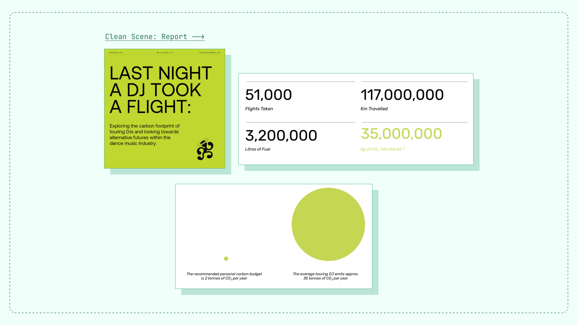
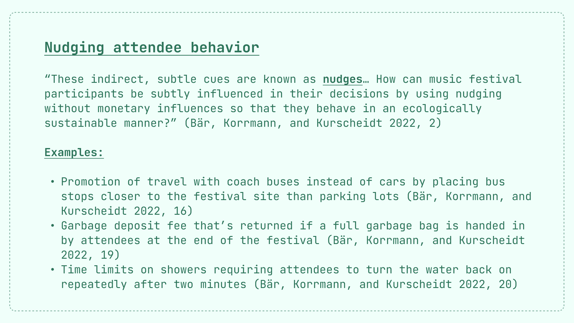
One research paper that stuck out to me in my initial research was Bär, Korrmann, and Kurscheidt's "How Nudging Inspires Sustainable Behavior among Event Attendees: A Qualitative Analysis of Selected Music Festivals."
Artists might not choose to use a new tool focused on sustainability alone. In order to build a tool that artists would consider using, I decided to focus on building a product that would address other pain points that they face in their work, while nudging them toward more sustainable practices. With this in mind, I honed my research question and set several design goals.
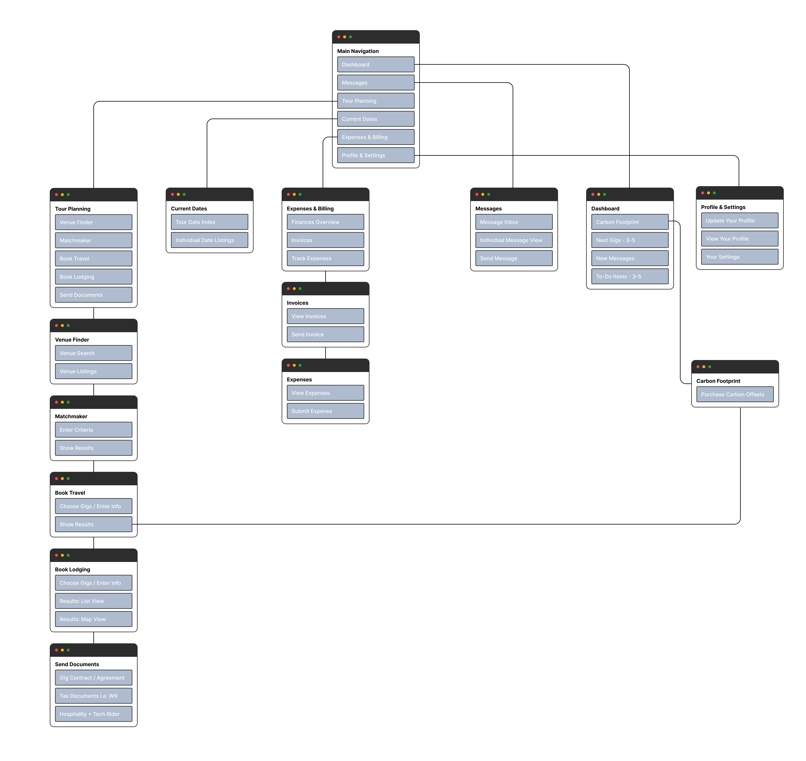
I started prototyping by creating a sitemap to think through the overall architecture of the product and its offerings (formatted from a modified template to save time and stay focused on content). Two core sections of the website would be the Matchmaker, which would help musicians find nearby gigs and fill open dates collaboratively with venues in the system, and the Dashboard, which would allow them to see their upcoming schedule, unresolved tasks, and their carbon footprint.
Because of time constraints on the project, I decided to focus on desktop prototypes for a specific user flow that would show how a musician could request a gig through the Matchmaker section, view their Dashboard, and book travel between gigs.
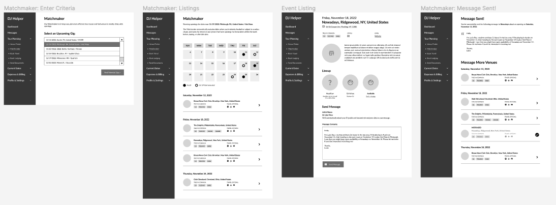
From there, I developed an interactive low-fidelity prototype walking through the aforementioned flow.
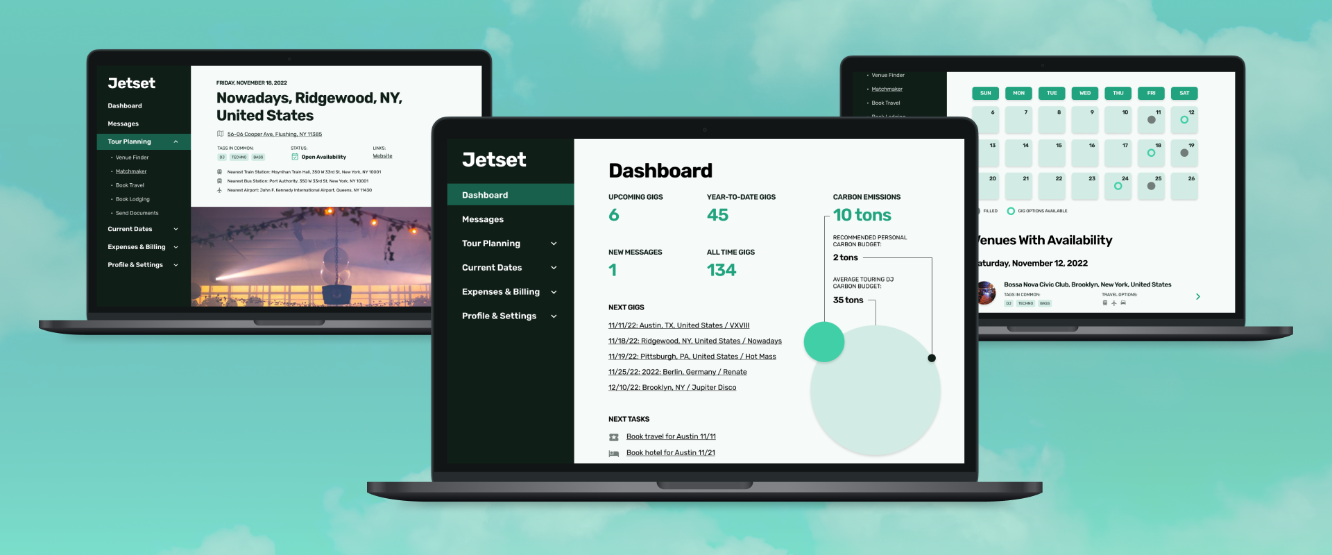
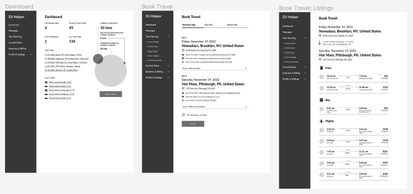
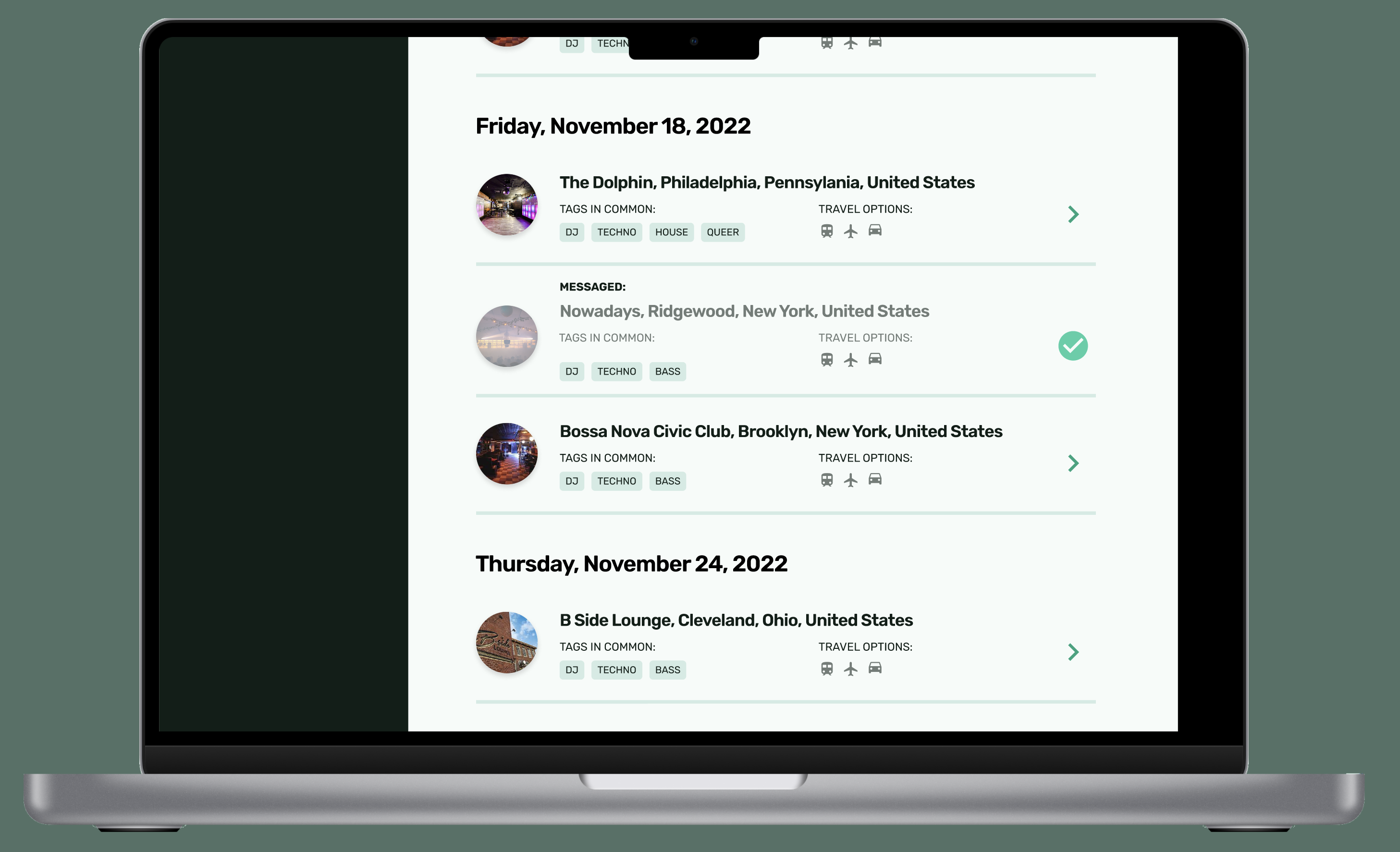
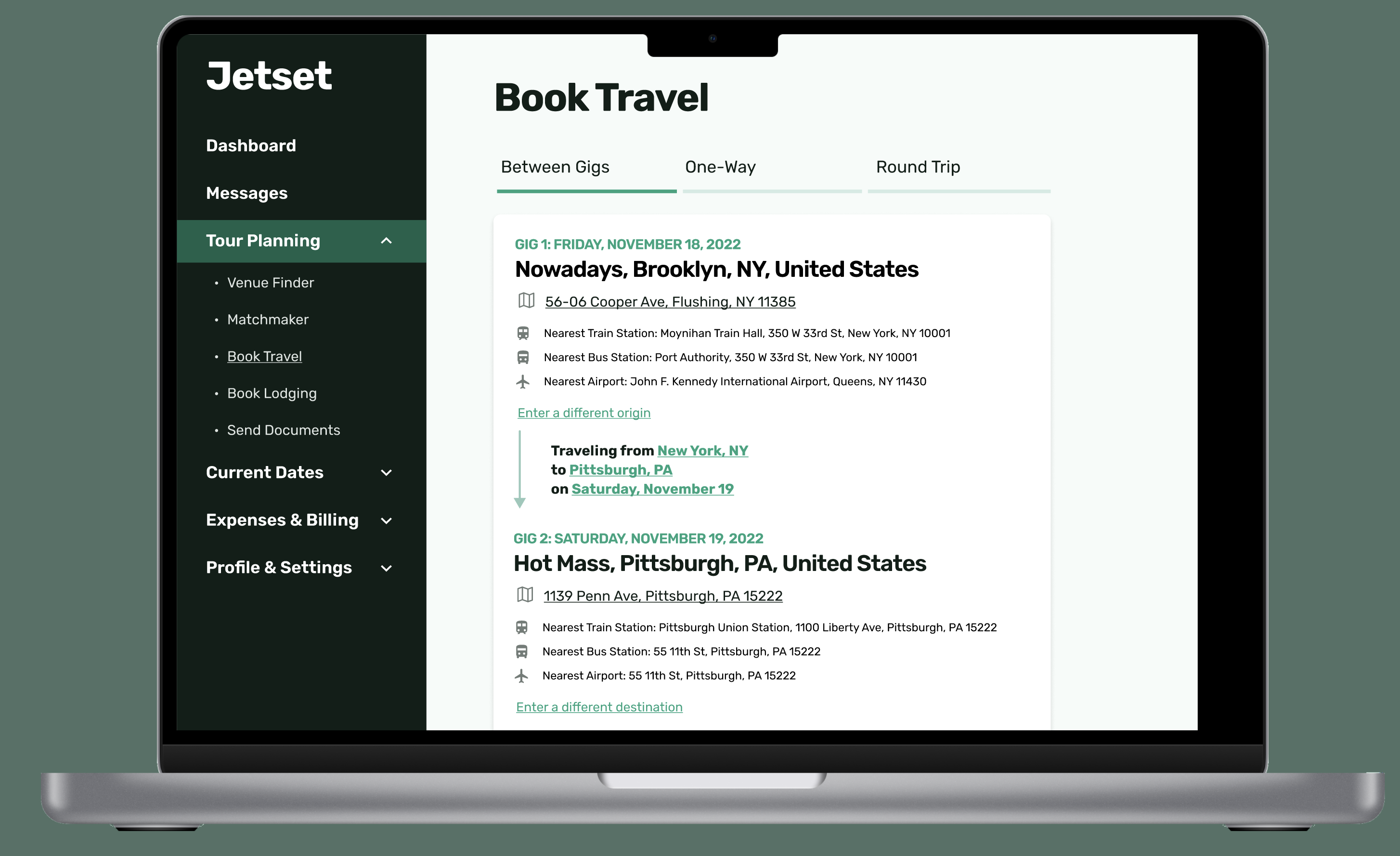
The Matchmaker functionality allows an artist to select an upcoming gig they already have scheduled, and find nearby venues in the system with openings, then message the venue directly. The Dashboard page lists the artist's next gigs, some statistics including their carbon emissions compared to the average, and tasks they need to complete. For example, if they confirmed a DJ gig at a venue, the task list would send them to a travel booking page, which I also wireframed. The travel tool would allow them to choose two gigs and automatically show options from the nearest airport, bus, and train stations, instead of needing to choose cities and compare across multiple sites.
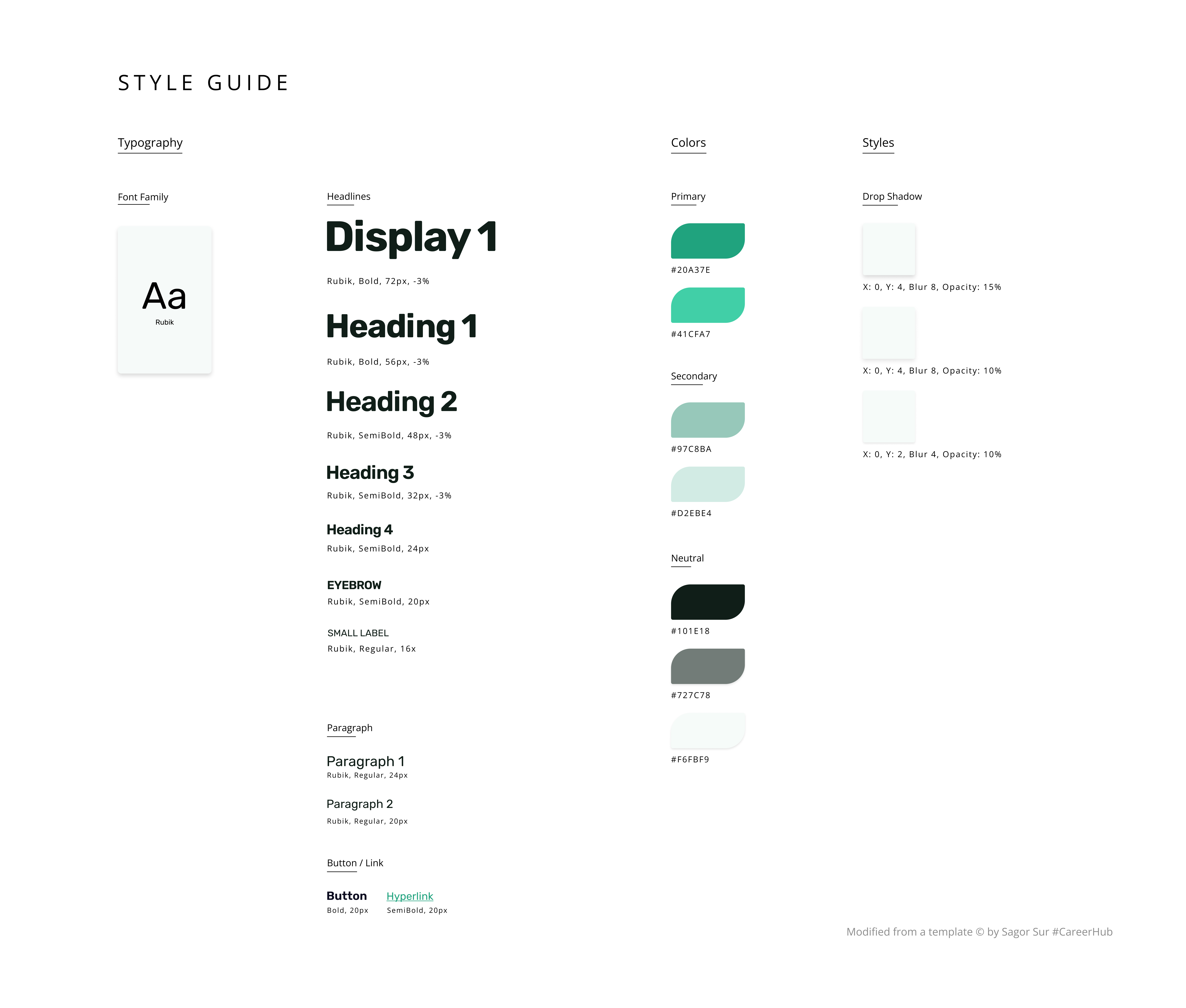
With a general sense of the flow, I moved on to develop a simple UI style guide before moving on to the high-fidelity prototype I planned to develop next. To focus on choosing colors and designing components, I started from a template by Sagor Sur to format the style guide itself.
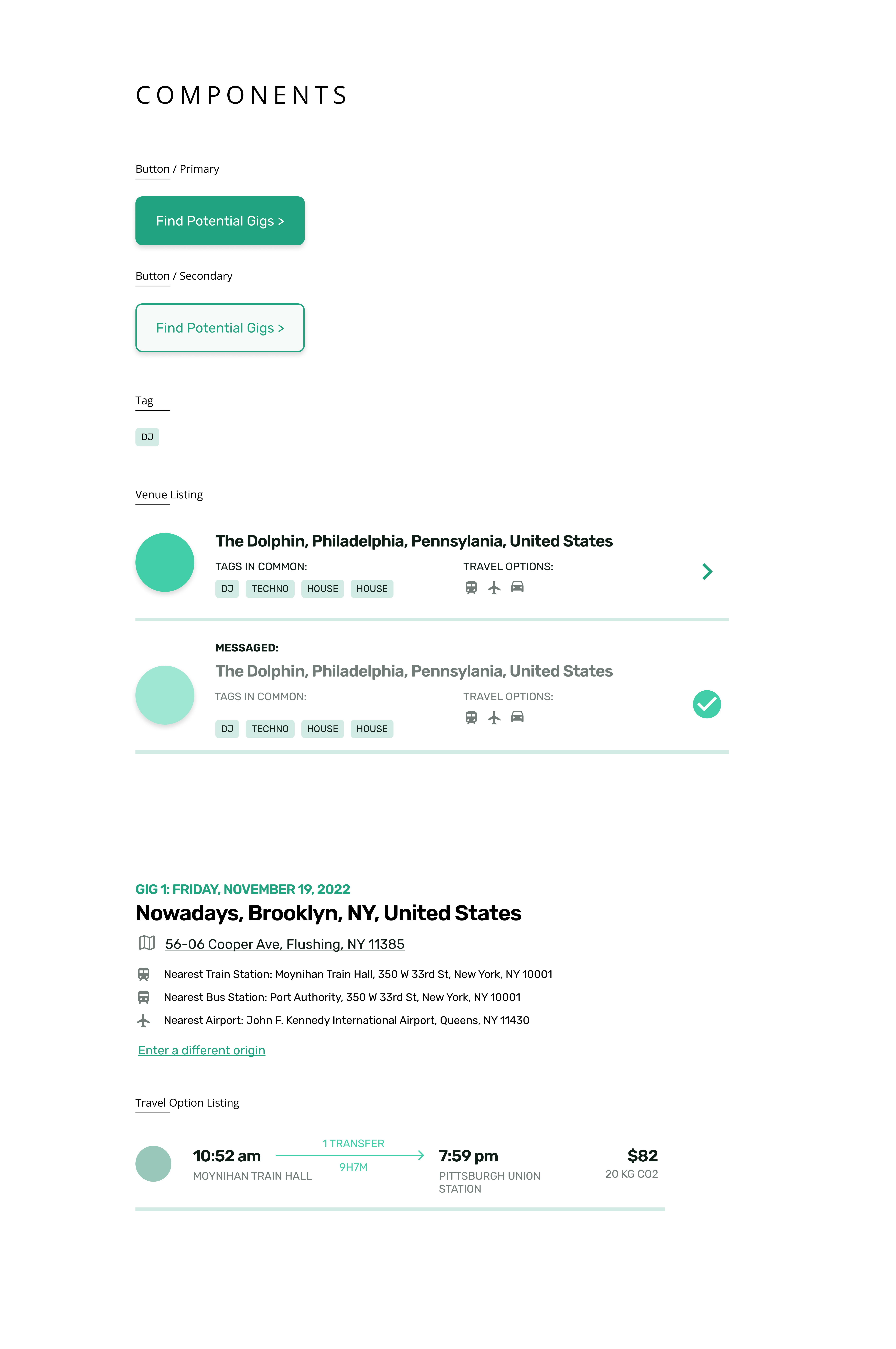
Finally, I moved on to develop the final, high-fidelity interactive prototype. I honed the styles and created a component guide for components that would be used across multiple pages.
In this UX research and product design process, I worked within a limited timeframe to imagine an application that could help ease current pain points experienced by touring DJs and musicians, while nudging them toward more sustainable practices.
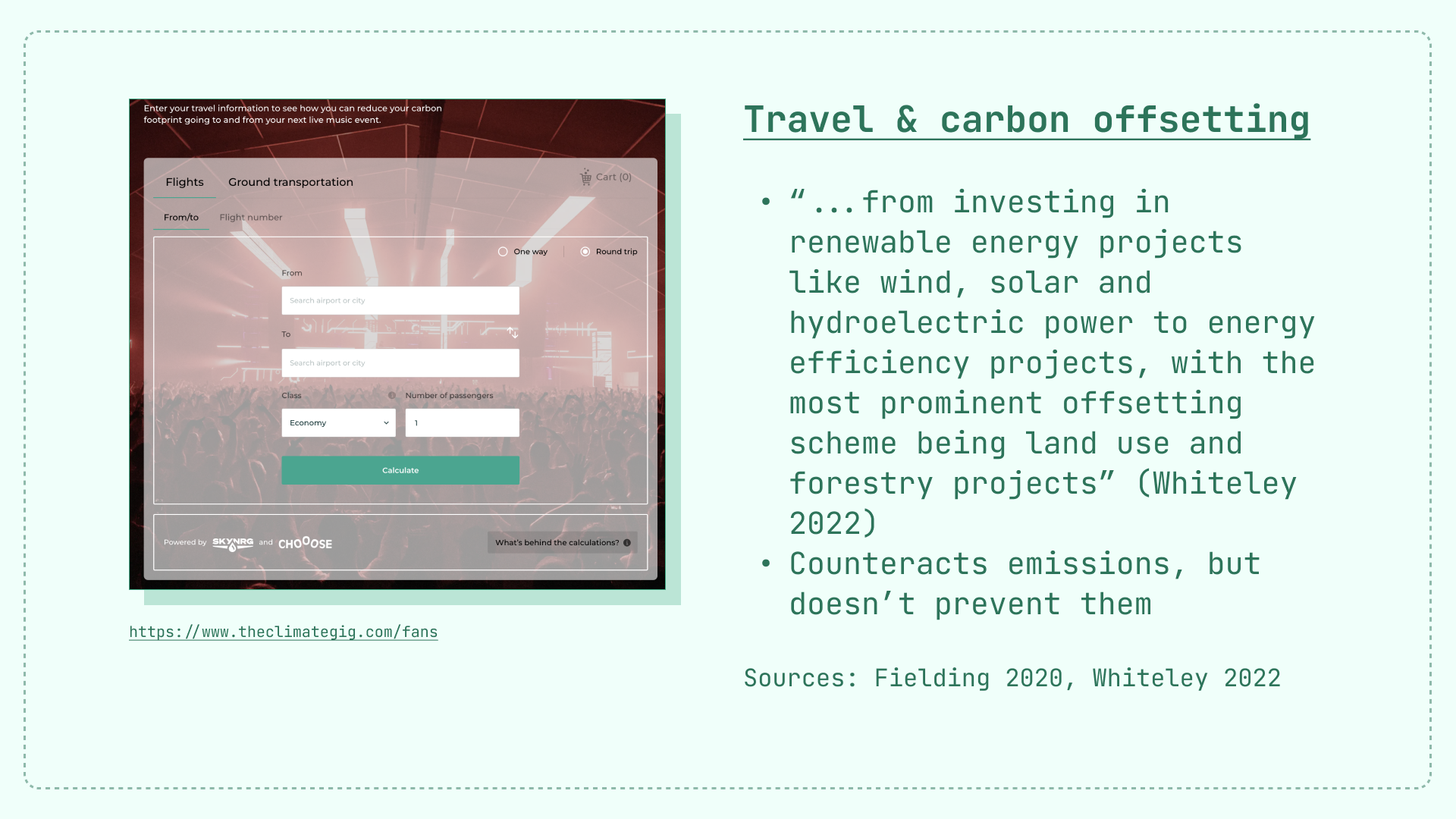
Some of these nudges are inherent to the design of the application — for example, the Matchmaker design encourages artists to book gigs that are near their existing gigs. In other areas, such as the Dashboard and travel booking pages, nudges are bit more visible: the Dashboard shows an artist's carbon footprint and helps them purchase offsets, and the travel booking pages list the carbon impact of each travel method.
If I were to expand this project in the future, my immediate next steps would be to:
Another notable limitation of this project is that it works within the bounds of how artists are touring today, when broader systemic change might actually be the most "sustainable" option. Could venues shift to focus more on local and regional artists, and less on touring DJs and musicians? Could musicians find alternate models for economic sustainability so that touring doesn't have to be so central to their income? Could we completely restructure the creative economy? Could we move towards new forms of travel and energy that are more sustainable?